

The Role of User Experience in SEO: Statistics and Best Practices
Learn how user experience (UX) influences SEO rankings, with key statistics and actionable best practices to improve site performance and engagement.
SEOmator's Mobile-Friendly Test fetches any URL twice — once as a desktop browser, once as a phone — and reports four responsive signals: the viewport meta tag, inline media queries, up to three external stylesheets, and whether a mobile user-agent gets redirected elsewhere. No pass/fail badge, no account, free.
 Reviewed by Charles Duncan
This is static analysis, not a rendering test. We fetch your HTML with a desktop user-agent and again with a phone's, parse the markup for a viewport tag and inline @media rules, then download up to three linked stylesheets and look for media queries in each. No JavaScript is executed and no page is painted.
No account and no verification step. Private hosts and internal IP ranges are refused before a request leaves our network, so the tool cannot be pointed at anything that is not publicly reachable.
One request carries a desktop user-agent, one carries a phone's. If the phone request finishes on a different URL, you are serving a separate mobile site and the destination is reported as its own signal.
The viewport tag, inline media queries and each stylesheet come back as separate rows carrying the value we actually found — so you can see which one is responsible instead of reading a single verdict.
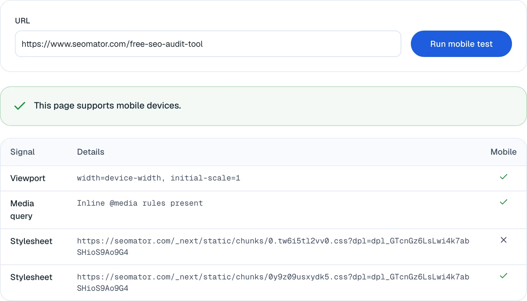
Every signal below runs without an account. A free SEOmator account adds history, monitoring and the rest of the audit.
Every check runs the URL twice, once with a desktop user-agent and once with a mobile one, and compares where each request lands.
We print the actual content value of your viewport meta tag rather than a tick, so a malformed or missing scale directive is visible.
Detects @media rules written directly into the page's HTML, which is how most CMS themes and page builders ship responsive layout.
Each linked stylesheet is downloaded and tested for media queries, then reported on its own row — the sheet with no responsive rules is named.
If a phone user-agent is redirected to a different URL, the destination is shown so you know you are maintaining two sites.
The target and every stylesheet URL are validated as public before a request is made, so the checker cannot be aimed at an internal address.
Keep every run against a URL so a regression after a theme update is a diff rather than a memory.
Get told when a page that passed starts failing — usually the first sign a vendor stylesheet was swapped.
Mobile rendering is one of 20 categories in the full audit. A free account runs all of them, including the mobile LCP check this tool deliberately does not perform.
History, alerts and the full audit come with a free account.
Create a free account Reviewed byCharles Duncan · Co-founder & CTO
I built this to answer one question quickly: does the page ship responsive CSS at all? It fetches your HTML with a desktop and a phone user-agent, prints the viewport tag, and downloads up to three stylesheets looking for media queries. What it deliberately does not do is render the page — so it cannot see tap targets that sit too close together, text that needs pinching, or a layout that overflows at 360px. It also stops at three stylesheets, and a lone @media print block is enough to make a sheet look responsive. Read a pass here as "the responsive plumbing is present", then run the speed test for what a phone actually experiences.
 Charles Duncan · Co-founder & CTO
Across the 100K+ sites we audited between January and July 2026, only 11.8% carried a critical failure in the Mobile category — but 58.4% failed LCP above 2.5 seconds on mobile. Responsive markup is close to universal now. Being usable on a phone is not the same thing as being fast on one.
The overall verdict turns positive if any single signal passes. A page with a good viewport tag and one responsive sheet will still show you the sheet that has no media queries at all — usually the legacy file nobody has opened in two years.
If the phone fetch lands on a different URL you are maintaining two sites. Googlebot has crawled mobile-first since July 2024, so the mobile version is the one that gets indexed — and on a split setup it is usually the thinner one.
The check looks for any @media rule, so a stylesheet whose only media query is a print block passes. If a sheet passes but the page still breaks on a phone, open it and confirm the queries are width-based.
Homepages get the design attention. Run a product page, a blog post and a form page — the templates that were built once and never revisited are where the unresponsive stylesheet survives.
Theme updates replace stylesheets. The viewport tag usually survives; a media-query-free vendor sheet arriving in position one does not announce itself.
If you followed a guide here looking for Google's Mobile-Friendly Test, it no longer exists. Google announced the shutdown in April 2023 and executed it on 1 December 2023: "Also starting December 1, 2023, we'll be retiring Search Console's 'Mobile Usability' report, the Mobile-Friendly Test tool and Mobile-Friendly Test API" (Google Search Central). The old search.google.com/test/mobile-friendly address returns nothing.
Google's reasoning was that the mobile web had matured and that plenty of third-party tools cover the same ground. What it did not say is that mobile usability stopped mattering — the same post is explicit that it "remains critical for success with Google Search". The signal moved out of Search Console; the requirement did not move at all.
This is why so many mobile-friendliness articles now contain a dead link. The advice was written against a tool that Google removed, and nobody went back.
The test at the top of this page fetches your URL twice — once with a desktop user-agent, once with a phone's — and returns four things rather than a verdict.
Redirect. If the mobile request finishes on a different URL than the desktop one, you are serving a separate mobile site and we show you the destination.
Viewport. We read meta[name="viewport"] and print its content value verbatim. A tag that exists but sets a fixed width, or blocks zooming, looks identical to a good one in a pass/fail tool.
Media query. Whether @media rules appear inline in the HTML itself, which is how most themes and page builders ship responsive layout.
Stylesheet. Up to three linked stylesheets are downloaded and each is checked for media queries, then reported on its own row. This is the row that usually does the work: a page can pass overall and still name the one sheet with no responsive rules in it.
This check reads HTML and CSS. It never executes JavaScript and never paints the page, and that boundary is worth stating plainly rather than hiding.
It cannot see tap targets sitting too close together, body text below a readable size, or a layout that overflows horizontally at 360px — all of which need a rendered page. It stops at three stylesheets, so a responsive rule living in a fourth is invisible to it. And because it matches any @media rule, a stylesheet whose only media query is a print block will pass.
The practical consequence: treat a pass as "the responsive plumbing is present", not as "this page is good on a phone". For the rendering half, open your browser's device emulation — Ctrl/Cmd + Shift + M in Chrome and Firefox — and set the width to around 360px.
Across the 100K+ websites we audited between January and July 2026, only 11.8% carried a critical failure in the Mobile category, while 58.4% failed Largest Contentful Paint above 2.5 seconds on mobile — the single most-failed rule in our entire 251-rule set. A further 29.6% failed Interaction to Next Paint above 200ms.
Read those two numbers together and the state of the mobile web comes into focus. Responsive layout is close to solved: themes ship it, frameworks assume it, and a site built any time in the last decade almost certainly has a viewport tag and media queries. Speed is not solved at all.
That is the honest limit of every mobile-friendly test, ours included. Passing means your page fits the screen. It says nothing about whether the visitor is still there when it finishes loading.
Source: SEOmator crawling and analytics data, January–July 2026 (100K+ websites audited, 50M+ pages crawled).
A missing or fixed-width viewport tag. Without it, mobile browsers assume a canvas around 980px wide and shrink the page to fit, which is what produces the zoomed-out look. The conventional value is width=device-width, initial-scale=1. A tag that pins a fixed pixel width, or sets user-scalable=no, is worse than a missing one because it looks present in most tooling.
One stylesheet with no media queries. Almost always a legacy or vendor file that survived a redesign. It rarely breaks the whole layout; it breaks one component, usually a table, a pricing block or a footer.
An m-dot redirect nobody remembers setting up. If a phone user-agent lands somewhere else, you are maintaining two sites and Google is indexing the mobile one.
Templates, not the homepage. Homepages get design attention. Run one URL per template — a product page, an article, a form — because that is where an unresponsive stylesheet survives for years.
Google finished the migration in 2024: "the small set of sites we've still been crawling with desktop Googlebot will be crawled with mobile Googlebot after July 5, 2024" (Google Search Central). Every site is now crawled and indexed from its mobile rendering.
The most common misreading of this is that it only affects mobile rankings. It does not. Google does not maintain a separate desktop index — it indexes the mobile version and serves that index to every device. Content, internal links or structured data that exist only on desktop are not "desktop-only"; they are absent, including from desktop results.
The rule that follows is parity. The mobile version should carry the same content, the same internal links and the same structured data as the desktop one. Collapsed accordions and tabs are fine — Google renders and indexes content hidden behind them — but content genuinely removed from the mobile HTML is content you have deleted.
Once the layout passes, the next question is cost: run the free website speed test for what a phone connection actually experiences, or the full SEO audit for all 20 categories at once.
Screen a prospect's site before the pitch. A named stylesheet with no media queries is a concrete, demonstrable finding — better than telling them the site "feels dated on mobile".
Run it after a theme upgrade or a CMS migration, across one URL per template. Vendor stylesheets get replaced during upgrades and nobody diffs the CSS.
Confirm a handoff before invoicing. The viewport value and the per-sheet result are evidence you can paste into the delivery note.
Google's retired test returned a single pass/fail. This returns the viewport value, the inline-media-query result and a row per stylesheet, so a failure points at a file.
Google retired both the Mobile-Friendly Test and the Search Console Mobile Usability report on 1 December 2023. Most guides still link to them.
No account, no email, no credit card, no per-day quota to unlock. Paste a URL and read the table.
The actual viewport content string and the actual stylesheet URL, so you can act on the result without opening devtools first.
It is static analysis. Tap targets, font scaling and horizontal overflow need a rendered page, and we say so rather than implying coverage we don't have.
The same fetch layer powers the full SEO audit, where mobile rendering sits alongside performance, structured data and AI readiness.
No. Google retired the Mobile-Friendly Test on 1 December 2023, along with the Mobile Usability report in Search Console and the Mobile-Friendly Test API. The old URL, search.google.com/test/mobile-friendly, no longer returns a result. Google's stated reason was that the mobile web has matured and better third-party tools exist. Many guides published before 2024 — and a good number written since — still link to it, which is why a broken link there is such a common finding.
Paste the URL into the tool at the top of this page. It fetches the page with a desktop and a mobile user-agent and reports four signals: the viewport meta tag and its value, whether inline @media rules are present, whether each of up to three linked stylesheets contains media queries, and whether the mobile request was redirected to a different URL. For the rendering side — tap target spacing, font size, horizontal overflow — use your browser's device emulation, and use a speed test for what the page actually costs on a phone connection.
A mobile-friendly website renders and works on a phone without pinching, zooming or sideways scrolling. In practice that means a viewport meta tag that maps the layout to the device width, CSS media queries that reflow the layout at small widths, tap targets big enough to hit with a thumb, and text that is readable without zooming. The usual implementation is responsive design — one URL and one HTML document that adapts — rather than a separate mobile site.
Google indexes the mobile version of your pages. Since July 2024 it crawls the whole web with the smartphone Googlebot, so the mobile rendering is the one that gets evaluated and stored. If content, links or structured data are missing from the mobile version, they are effectively missing from the index. Mobile usability is not a separate ranking bonus so much as a precondition — a page that fails on a phone is being judged on that failing version.
Yes. This is the most common misconception about mobile-first indexing. Google does not keep a separate desktop index — it indexes the mobile rendering and serves that index to every device. If your mobile version drops a block of content that only exists on desktop, that content is gone from desktop results too. The practical rule is parity: the mobile version should carry the same content, internal links and structured data as the desktop one.
It tells the browser how to map the page onto the device's screen. Without it, mobile browsers assume a desktop-width canvas — typically 980px — and shrink the whole page to fit, which is what produces unreadable text and a zoomed-out layout. The conventional value is width=device-width, initial-scale=1. This tool prints the actual content value it finds, so you can spot a tag that exists but sets a fixed width or blocks user scaling.
In your browser, open developer tools and switch on device emulation — Ctrl/Cmd + Shift + M in Chrome and Firefox — then pick a device or set a width around 360px. That changes the viewport and the user-agent, which is enough to trigger responsive CSS and most server-side mobile redirects. It is a rendering view, so it complements this tool rather than duplicating it: emulation shows you what the page looks like, the check above tells you which stylesheet is responsible.
No, and that limit is deliberate. It performs static analysis: it reads your HTML and CSS for responsive signals but never executes JavaScript or paints the page. That makes it fast and makes the result explainable — a failure names a file. It also means it cannot detect tap targets that are too close together, text below the readable size, horizontal overflow, or a responsive layout that is injected by JavaScript at runtime.
Mobile-friendly is about layout: does the page fit and function on a small screen. Mobile page speed is about how long it takes to become usable. They fail independently, and speed is the far more common problem — across the sites we audited between January and July 2026, 11.8% had a critical Mobile-category failure while 58.4% failed LCP above 2.5 seconds on mobile. A page can pass every check on this page and still be slow enough to lose the visitor.
Event-driven beats calendar-driven. Re-test after a theme change, a CMS or plugin update, a redesign, or any deploy that touches CSS — those are the changes that swap stylesheets. Beyond that, a quarterly pass over one URL per template is enough for most sites. A free account keeps the history so a regression shows up as a diff instead of relying on you remembering last quarter's result.
Deeper reading from the SEOmator blog on what this tool measures.
Learn how user experience (UX) influences SEO rankings, with key statistics and actionable best practices to improve site performance and engagement.

Run a complete Shopify SEO audit for 2026 with this 4-phase checklist covering Core Web Vitals (INP), AI Overviews readiness, structured data, and free audit tools.

Organic search drives 53% of SaaS traffic at a 702% ROI. This 8-step technical SEO audit fixes crawlability, Core Web Vitals, canonicals, and AI-search visibility.
Mobile rendering is 1 of 20 categories. Run the full 251-rule audit on your site, free.


